Speeding up GAE Datastore Reads with Protobuf Projection

Like most frameworks these days, the Google Appengine (henceforth, GAE) SDK provides an API for reading and writing objects derived from your classes to the datastore. This saves you the boring work of validating raw data returned from the datastore and repackaging it into an easy-to-use object. In particular, GAE uses protocol buffers to transmit raw data from the store to the frontend machine that needs it. The SDK is then responsible for decoding this format and returning a clean object to your code.

GAE data access web request

This utility is great, but sometimes it does a bit more work than you would like. I found one query that was fetching 50 entities, each with over 60 properties. Using our profiling tool, I discovered that fully 50% of the time spent fetching these entities was during the protobuf-to-python-object decoding phase. This means that the CPU on the frontend server was a bottleneck in these datastore reads!

Profiled web request showing slow translation

The problem was that the GAE SDK was deserializing all 60 of the properties from protobuf format, even though the code in question only required 15. The best way to solve this problem is with projection queries provided by the GAE SDK, which reduces both the download time and the objectification. But, each projection query requires its own perfect index. I wanted something with a little less overhead.

Using the magic of monkey patching (run within appengine_config.py), I modified the pb_to_entity function (which exists inside the GAE SDK) to drop unnecessary properties before performing the protobuf-to-python-object translation. This is much like the scenario where a new property is added to a Model. Entities that have not been written since the new property was introduced will return a protobuf that excludes the newly introduced property. With this change, the 2.9 seconds spent decoding was reduced to 900 milliseconds, a 3x improvement!

Data access diagram of a GAE web request with new protobuf projection stepYou can get the gist of how I got this working here. The main points are:

  • appengine_config.py monkey patches the relevant functions inside the GAE SDK so that my function runs instead.
  • A context manager sets a global, thread-local variable with the names of the properties that we care about. The custom function only operates when this global variable is set.
    • This means you should query against exactly 1 Model within the context.
  • The __getattribute__ function is monkey-patched to provide access safety for projected objects. When you try to access an excluded property from an object that was created during protobuf projection, an exception is raised. This is a feature that “official” projection queries do not offer.
  • Various put() functions are monkey-patched to disallow putting a projected entity. This provides parity with “official” projection queries.

Now that this code has been written, I will be on the hunt for more queries that might benefit from its use. If you use this code in your application, I would love to hear about it!

Building a machine learning pipeline in Google’s Cloud

Khan Academy uses a few statistical models to personalize content around the site. One of the most important, the knowledge model, has been discussed on this blog before. The process of training these models: gathering data, training parameters, deploying parameters, and monitoring parameter performance, is tedious. I set about to automate as much of this process as possible. Discovering parameters requires a machine that 1) is able to run the scipy.optimize python module, and 2) has several GB of memory. These requirements and the benefits of close integration with Khan Academy’s existing Google Cloud systems (read: pretty much everything) led me to choose Google’s new managed VMs with some help from BigQuery to implement this system.

I have discussed the training process for the knowledge model before, but a quick refresher is as follows:

  1. ProblemLogs store a student’s correct or incorrect attempt on a single problem for a single exercise.
  2. ProblemLogs are processed in chronological order to re-create the KnowledgeState that existed for that student at the moment the question was answered.
  3. This creates a training set like KnowledgeState -> Correct/Incorrect that lets us predict whether students will get the next question correct based on their current KnowledgeState.
  4. We maintain a single KnowledgeState object for each student, but train parameters for each exercise, such that each exercise interprets the KnowledgeState in a different way.
  5. Right before prediction, the global KnowledgeState is augmented with local ExerciseState data to improve predictions, but this detail is omitted in the rest of this article.

Here’s a data flow diagram of the entire system:

A dataflow diagram of the automated knowledge model parameter training process.

Gathering the data

The ProblemLog table which contains the students’ history of attempts exists in BigQuery. Exporting from BigQuery to CSV files on Google Cloud Storage was pretty easy with the BigQuery API. However, when exporting >1GB of data, BigQuery shards the export into many 170MB files.

Munging the data

The problem with these 170MB files is that an individual student’s data is spread randomly among and within the shards, but I need to iterate over a single student’s data in chronological order. Ideally, an ORDER BY clause in BigQuery could solve this problem, but all of my attempts ended with a Resources Exceeded error. (Which is pretty common, based on the BigQuery section of Stack Overflow.)

So, I created a MapReduce job to map over each of the shards, sort them in-memory, and then write the sorted shard back out to Google Cloud Storage. This was a map-only job that used the _GoogleCloudStorageInputReader provided by the MapReduce library and streamed the sorted file back into GCS with the appengine GCS client library. Here’s a gist of this code.

Computing the features

The next step is to read each student’s data in chronological order. The previous step sorted the problem logs by student within each shard, but chronological ordering must be done across the shards. I created a MergeReader class that opens a handle to each of the shard files and collects a single student’s problem logs from the top of each shard. When all of a single student’s problem logs are in memory, they are sorted chronologically, and processed to emit training data.

As training data is emitted, a BatchWriter class writes that data to multiple shards, making sure that all data for an individual exercise is written to the same shard. With each shard wholly containing an exercise’s training data, the parameter training process can be parallelized.

Training the parameters

Now that the training data has been computed and is waiting in properly sharded .csv files on GCS, the parameter training process can begin. The training process is another MapReduce job that uses the _GoogleCloudStorageInputReader to iterate over each of the training data shards. All training data for an exercise is loaded into memory, formatted as a numpy array, and sent over to scipy.optimize to discover optimum theta values. Once an exercise’s parameters are trained, they are written into the production datastore so that we can start using them for predictions moving forward.

Monitoring parameter performance

After new parameters are deployed, we monitor their accuracy with a simple dashboard that plots average log likelihood and number of samples over time. This graph is generated with a BigQuery that aggregates ProblemLogs on a per-exercise/per-day basis and computes average log likelihood for each day.

A graph showing average log likelihood and number of samples over time for a specific instance of the knowledge model.

Khan Academy Mastery Mechanics

If you’ve used Khan Academy, I’m sure you’re familiar with this graphic. It is shown at the end of each task to inform you of how you have progressed. You may not be familiar with the (somewhat complex) mechanics behind how students progress through each level of mastery, and that’s what I hope to clarify.

Mastery progression icons

Setting the Scene

First, let’s outline some vocabulary. Khan Academy has many different exercises. Each of these exercises contains a set of problem types, and each problem type has a set of specific questions. For example, the Count to 100 exercise contains two problem types. One asks you to fill in the missing number in a giant grid.

Counting 1

The other asks you to do the same thing, but with colored, skip counted numbers.

Counting 2

Each of these problem types has several unique items to give students a variety when answering questions within the exercise. All items within an exercise are assumed to have equivalent discernibility. This is certainly false, but a compromise we have made for now. It allows us to pick an item at random whenever we think you’re ready to work on that exercise.

Tutorial Mode: Plan your own practice problems

There are three ways students work on exercises on Khan Academy. The original way is known as “tutorial mode”. Students navigate directly to the exercise they wish to practice, and the page gives them randomly selected questions. They may revisit this exercise at any time and continue to do problems as long as they like.

Tutorial mode

Learning Dashboard: Work on tasks we recommend

The new and improved ways are both accessed via the learning dashboard. The learning dashboard contains Practice Tasks and Mastery Challenges. Practice tasks give you items from a single exercise until you fulfill the completion criteria (typically, 5 correct in a row). Mastery Challenges give you a set of items from many different exercises (typically 6 different exercises) and only one chance to get each item correct. Mastery Challenges contain several different types of cards: Mastery, Review, Challenge, and Analytics. The rest of this article will focus on these two access patterns.

Practice tasks and mastery challenges

Practice Tasks and Mastery Cards

Practice tasks show up on your learning dashboard based on our recommendation engine’s ordering of the exercises within the mission. Once you finish a practice task, you will move into the practiced state for that exercise. We will also recompute which exercises should show up as practice tasks on your learning dashboard.

After some time (typically, 16 hours), mastery cards will become available in your Mastery Challenge for each exercise in the practiced state. If you get the mastery card correct, this will move you into level two. If the recommendation engine predicts that you are doing very well in this exercise, it may promote you all the way to level three: Mastered. There is always a delay of some time between each promotion, which is one way we use spaced repetition to enforce long-term retention.

The majority of the work you do on the Learning Dashboard will be within Practice Tasks and the resulting Mastery cards. Challenge, Review, and Analytics cards are relatively rare.

Challenge Cards

As you complete practice tasks, we may determine that you are likely to already understand the concepts present in other exercises. If you have never done a problem in an exercise, but our knowledge model predicts that you will perform very well in it, we will give you a Challenge card. If you answer this challenge card correctly, we will promote you all the way from Unpracticed to Mastered. You won’t even have to do a practice task for this exercise!

Review Cards

After you reach the Mastered level, we issue some review cards after an even longer delay. Review cards follow a spaced repetition pattern similar to mastery cards. The first review card may show up 4, 8, or 32 days after you reach Mastered. After you answer that card correctly, the next card will show up after twice as many days (8, 16, or 64). Each correct review card will again double the number of days until the next review card shows up. Once the delay between review cards reaches 256 days, it will no longer double. Any time you get a review card wrong, you will be demoted to mastery level 2. You will start the review cycle again after getting a mastery card correct.

One exception to this is if the exercise is “covered” by another exercise. If the covering exercise is Mastered, it is assumed to take care of all review cards. The covering relationships are currently hand-curated and a rather small subset of exercises.

Analytics Cards

To help us understand how all of our students are learning, we sometimes issue an analytics card. Analytics cards are currently randomly sampled from all of our math exercises, meaning that if you are working on a 3rd grade mission, you may see a Calculus exercises as an analytics card. The random sampling is how we verify that students maintain a general, long-term learning gain. Sometimes these cards cause confusion for the students who get one way outside of their ability, but the data we get from these responses has allowed us to make some very dramatic improvements to mastery progression without sacrificing long-term learning efficiency. We are looking for ways to improve this experience without degrading the data we collect.

Recap and Infographic

The learning dashboard contains two tasks: practice tasks and mastery challenges. Practice tasks contain random problems from a single exercise and require that you fulfill the completion criteria. Mastery challenges contain a mix of mastery, review, challenge, and analytics cards – each from a different exercise. The correct or incorrect responses to each of these cards will move your mastery level up or down accordingly. Once you answer all of the questions in the mastery challenge, a new one is computed. If there are no cards available for the Mastery Challenge, none is shown.

Mastery progression infographic

I hope that brings some clarity to how we move students through our mastery levels. Note that we are constantly experimenting with improvements to these mechanics, so this post may no longer be 100% correct by the time you read it. If you have questions, don’t hesitate to ask!

Improving Khan Academy’s student knowledge model for better predictions

Recently, I have been working on improving Khan Academy’s user knowledge model to get better predictions on how each student will perform on exercises. We use this model for many things including assessing a student’s mastery of an exercise, and recommending the next piece of content that they work through. The following is an overview of the model, with a link to the full write-up of the work I did to improve and measure it at the bottom. This write-up was meant for an internal audience, but I thought it may be interesting to others as well. Let me know if you have any questions or ideas for improvements!

————————————————————————————————

Khan Academy models each student’s total knowledge state with a single 100-dimensional vector.  This vector is obtained by the artful combination of many other 100-dimensional vectors, depending on how that student has interacted with exercises in the past. Furthermore, we model a student’s interaction with a single exercise with a 6-dimensional vector for every exercise that student has interacted with.

These feature vectors allow us to build the following statistical model to predict a student’s ability to correctly answer the next question in an exercise, even if the “next question” is the very first for that exercise.

User Knowledge Model

To make a prediction, we lookup that student’s exercise-specific features and their global knowledge state features, and multiply each one by the corresponding theta. So, our job is the find the values for those 107 theta values which will give us the highest likelihood of correctly predicting a student’s success on the next question in an exercise. A different set of theta values is found for each exercise. This allows each exercise to weight aspects of the KnowledgeState differently. The KnowledgeState should only influence predictions for exercises that are highly correlated to the exercises it is composed of.

If we compute the likelihood that a student will get the next problem correct for all exercises, we can sort the list of exercises by these likelihoods to understand which exercises are more or less difficult for this student and recommend content accordingly. One way we use this list is to offer the student “challenge cards”. Challenge cards allow the student to quickly achieve “mastery” since their history in other exercises shows us that they probably already know this exercise well.

The 100-dimensional vectors are known as random components. There is one random component vector for each exercise known when the values are discovered. The vectors are computed deterministically and stored in a database alongside the theta values.

This means that a student’s performance on an exercise that was added to the site after a set of theta values were discovered will not influence any other exercise’s prediction. It cannot be added to the KnowledgeState because the random components for this exercise do not exist. It also means that we cannot predict a student’s success on this new exercise. Theta values for this exercise do not exist. When a student’s predicted success is null, the exercise is said to be “infinitely difficult”.

The thetas we are using today were discovered in early 2013, which means that they do not account for the all of the new ways students are using the site (e.g. via the Learning Dashboard).

This project sets about to achieve two goals:

  1. Upgrade the KnowledgeState mechanism so that it can understand how newly added exercises influence a student’s total knowledge state.  Technically, this means computing new random component vectors, and using them during the discovery process.

  2. Discover new values which will understand all of the new ways students use the website along with all of the new exercises that have been added since they were last discovered.

Click here to read the full details on the data collection, verification, performance analysis and conclusions of this project.

Data engineering at startups

I’ve spent the last year on the data science (a.k.a. analytics) team at Khan Academy. Here are some of the lessons I have learned during that time. These lessons won’t apply to everyone, but if you’re working at a small company that fosters a data-driven process across the company, they should help you be more effective.

Being on the data science team means that people from around the company will come to you with questions of all shapes and sizes. Decisions are being made very quickly, and people want data to back up their choices. If you’re like me, these questions will immediately start your mind racing through all of the options to collect, organize, and display relevant data. You may have visions of a beautiful real-time dashboard sitting open in browser tabs company-wide.

But building dashboards takes time, and your time is valuable. Your job is to spend the least amount of time providing the most valuable data for the most valuable decisions. You need to optimize your time-per-decision ratio. Here’s the steps I go through when someone comes to me for some juicy data.

Understand the question

First, you need to translate the general question into specific sub-questions. When someone asks you “What is the best video on Khan Academy?” your response should be, “I don’t know, how do you define a good video?”

The answer to this question will outline the data that you need to find. A good video may have a high watch percentage, meaning people watch most of it before stopping. Or, maybe a good video is one that has received a lot of “upvotes”.

As you understand what data you want, you should rank them by difficulty. The effort required to retrieve each piece of data will fall somewhere along this spectrum:

effort_spectrum

Running some aggregations over an existing table is easy. Joining a few big tables, outputting an intermediate result (or two), and calculating aggregates over that is harder, but still doable. Building new UI components to collect feedback from users, letting that run to build up a good sample size, and then computing summary statistics is very hard.

Understand the value of possible answers

Before you start querying, you should explore what will be done with the data. What do you expect the answer to be? What will you do if the answer is opposed to your expectations? Try to think of all the possible outcomes, and the actions that would result from each. You’re looking for actions that are imminent and large. If you don’t find any, this may not be a valuable question.

Analyze early and often

After you fetch what you believe to be the most valuable data, you should immediately try to answer the question. As a data engineer, you should spend a small amount of time trying to answer the question yourself, to verify that the data is reasonable. But, the real analysis should be done by the person whose actions depend on the results. They’re best suited to understand anomalies and form the narrative that the data is telling.

I usually do this by sending a simple Excel file to the analyst. The initial analysis will surely come back with questions about how certain data points are computed, and provide more insight on which data points are most valuable.

Think of Excel as the ultimately flexible dashboard. Anyone can add charts, graphs, custom sorting and filtering, and conditional formatting at the click of a few buttons! You should always include a “Download as CSV” button on any web dashboard for exactly this reason.

Automate querying

When you have developed a valuable set of data, people will ask for updates more frequently. If your query is relatively simple to perform over your data warehouse, like BigQuery, you should just write up a quick wiki page and point people to that.

If your query is more complex than this, it might be worthwhile to automate the moving parts. Be sure that any work you do to automate the query can be leveraged if you continue on to building a dashboard. Just don’t forget the long tail of ongoing development!

Ok, now you can build that dashboard

After all this, you should have some pretty pristine data that is very precisely answering a specific question. Which is a perfect place to start when building a dashboard! Data visualization and interactivity is an art, of which I claim very little expertise. If you have some great resources, please drop them in the comments!


BigQuery at Khan Academy

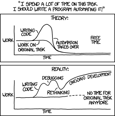
Previously, I wrote about the three frameworks we use for data analysis at Khan Academy. Since then, we have automated the export of production data into BigQuery and are regularly using it to perform analysis. We have all but deprecated our Hive pipeline and things are going great! Here, I’ll go over what has gone well, what concerns we have, and how we set everything up.

Benefits

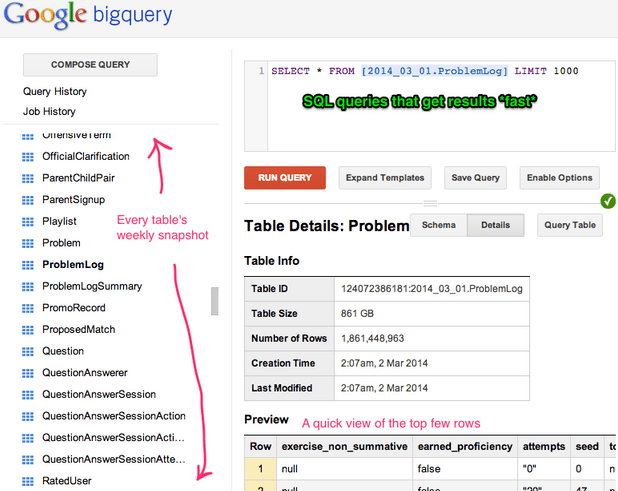
The biggest benefits are the easy integration with other Google services, and a great querying interface. We also enjoy using the BigQuery API to pull data into various python or R analysis scripts.

Getting our data from the AppEngine datastore into BigQuery was primarily done by copying some code examples that Google has published, and hooking them up with some extra functionality like robust error checking, scheduling, and custom transformation. It was not trivial to get things working perfectly, but it was much easier than setting Hive up. Since all of the processing happens with Google libraries, it is easy to manage our data warehousing jobs alongside the management dashboards that we use for the rest of the website.

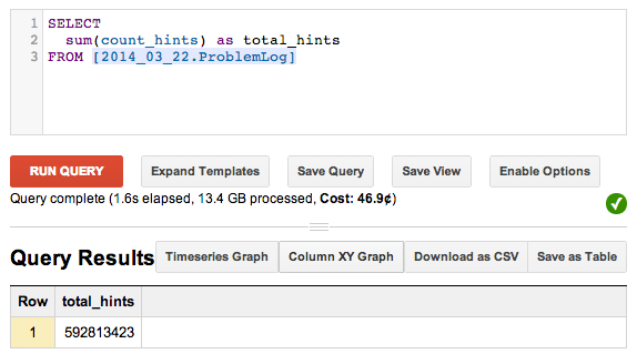
The querying interface was what got us excited about BigQuery when we were trying to decide if we could replace our Hive pipeline. The biggest benefit is the speed at which results can be returned, particularly over small datasets. Our Hive setup took a minimum of 60 seconds to spin up a distributed query, even if the dataset was small. This is maddening when you’re debugging a new query. BigQuery is blazingly fast, right out of the box. Here’s a query that sums a column over 1,939,499,861 rows in 1.6 seconds, and displays the result in your browser.

BigQuery Speed Example

The browser-based querying interface is friendly enough that we were able to train people across the company to perform their own queries. Jace led a workshop to teach everyone the basics of SQL, and since then we have seen increased adoption of BigQuery analysis across the company. The “business people” love the power of their new skill, and the data science team is able to more effectively deliver insight. That may mean helping someone debug a query they’re working on, or writing a query that they can run and tweak as they see fit.

 BigQuery workshop

Concerns

The concerns we have are cost and flexibility. I feel like I should mention them, but, honestly, they pale in comparison to the benefits.

I have not done a deep comparative cost analysis, but it is clear that our Google bill has gone up significantly since loading up BigQuery with our production data. Part of this is a function of increased usage because it is simply more useable. We are working on revamping our A/B testing framework to log events into BigQuery for easy analysis, and cost has been a factor we’ve kept in mind while designing the system.

BigQuery’s SQL implementation is powerful, but omits many of the advanced features found in HiveQL. Native JSON processing and user-defined functions are two that we miss the most. BigQuery also complains about large JOIN or GROUP BY operations. Adding the EACH keyword in these cases often solves the problem. When it doesn’t, your only recourse is to do some manual segmentation into smaller tables and try again. The lack of flexibility is Google’s way of “saving you from yourself” by only letting you do things that will perform well at scale. This is usually helpful, but there are some scenarios where “getting under the hood” would be useful.

**UPDATE**: As I was writing this post, Google announced both a decrease in cost and the addition of native JSON processing.

How we set it up

Our BigQuery data warehousing pipeline consists of three stages:

  1. Backing up production data onto Google Cloud Storage
  2. Importing raw data from Cloud Storage to BigQuery
  3. Importing transformed data from Cloud Storage to BigQuery
    1. Read raw data from Cloud Storage
    2. Write transformed JSON data back to Cloud Storage
    3. Import transformed JSON data from Cloud Storage to BigQuery

This process runs every Friday evening, giving us a fresh snapshot of the entire production datastore ready for queries when we arrive Monday morning.

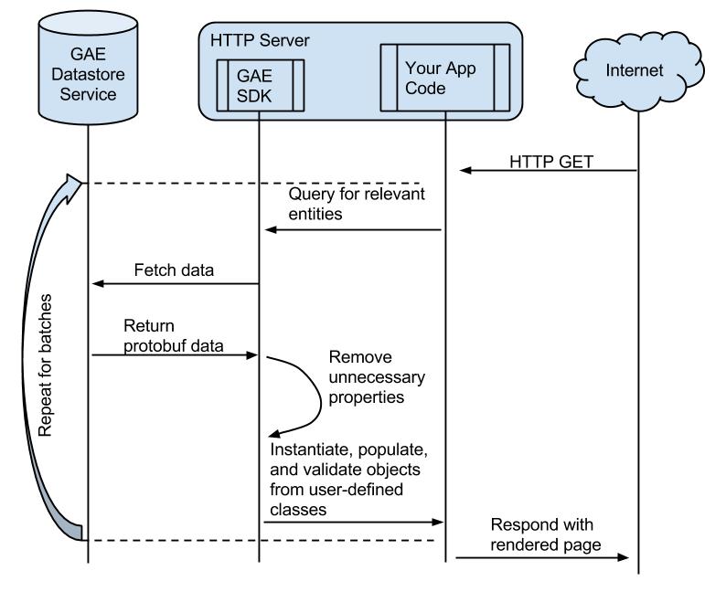
We use Google’s scheduled backups to serialize our datastore entities into files on Google Cloud Storage. We created a small wrapper around the `/_ah/datastore_admin/backup.create` API to start several batches of backups.

A cron job runs every 5 minutes to detect when the backups have made it onto Google Cloud Storage. When a new backup is ready to be loaded into BigQuery we use the BigQuery Jobs API to kick off an ingestion job, specifying DATASTORE_BACKUP as the sourceFormat.

After the load job finishes, BigQuery will have an almost identical copy of the datastore ready for super-fast queries.

BigQuery Data Warehouse

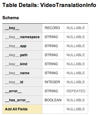
The automatic deserialization of the DATASTORE_BACKUP format works well for most properties, but properties that contain more complex data are ignored. For example, this model basically winds up empty in BigQuery. Each entity’s key is serialized, but everything interesting about this model is stored in the JsonProperty.

class VideoTranslationInfo(ndb.Model):
    """Mapping YouTube ID -> dict of YouTube IDs by language."""
    translated_youtube_ids = ndb.JsonProperty()

Raw VideoTranslationInfo

We need a layer to transform the datastore format into something that BigQuery can understand. Google has a great codelab describing exactly this process. Google’s implementation uses a DatastoreInputReader to map over the datastore entities directly. We found that mapreducing over the backup files on Google Cloud Storage was just as easy and guarantees that the raw and transformed datasets are consistent. Plus, there is no danger of causing performance problems for users interacting with the production datastore. Our implementation uses JSON instead of CSV because it allows for repeated records. We made the system pluggable so developers could easily add new custom transformations to any entity with complex properties.

Running the VideoTranslationInfo through its corresponding transformer results in a much more useful schema: Transformed VideoTranslationInfo

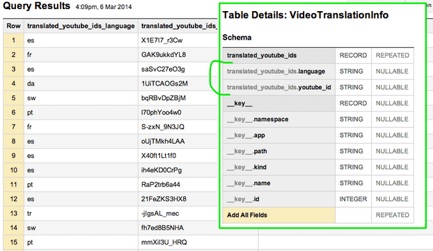
Daily request log export

We also export our web request logs into BigQuery. This is pretty easy to automate by deploying the log2bq project from Google. This is great because it allows “grepping” over the server logs with tremendously parallelized SQL.

Next stop: dashboards

Now that we have a wealth of data in BigQuery, I want to try building a web dashboard to  visualize some of the most interesting results.

Have you used BigQuery? Do you have any success stories or complaints?

Props to Chris Klaiber, Benjamin Haley, Colin Fuller, and Jace Kohlmeier for making all of this possible!

How to ignore exceptions within an appengine datastore query

Let’s say you have a bunch of entities stored in Google’s AppEngine Datastore, and you want to run a query over all of them, but you don’t really mind if a few are missing. For example, computing summary statistics over log files.

class LogRecord(ndb.Model):
    message = ndb.StringProperty()

query = LogRecord.query()
for record in query:
    update_statistics(record.message)

This code will work fine for small batches of entities, but when you start computing over hundreds of thousands, appengine will eventually raise an exception for some reason or another. And then you have to start over.

What we need is a resilient query. One that will iterate over the query results and simply discard any entities that throw exceptions. We want as much data as we can get, but we don’t want to stop iterating if we hit a few bumps along the way. The show must go on!

def resilient_query(query, max_failures=10):
    failure_count = 0
    query_iter = iter(query)
    while True:
        try:
            if failure_count >= max_failures:
                raise StopIteration("Failure threshold crossed.")

            next_result = query_iter.next()
            yield next_result
        except StopIteration:
            raise
        except Exception, e:
            failure_count += 1

And now we can just need to…

query = resilient_query(LogRecord.query())
for record in query:
   update_statistics(record.message)

One downside of this is that it will omit entities that threw an exception, even if that exception was transient and would have disappeared with a retry.

It’s also interesting to note that the resilient_query function will work for any iterator that may throw exceptions in the middle, as long as that iterator knows where to pick up where it left off. You can see that and some more details in this gist.

Automating Funnel Analysis with the MixPanel API

The content on Khan Academy is organized into a large taxonomy that breaks down by Domain, Subject, Topic, and Tutorial.  For example, information about quadratic equations is located in the Math domain, Algebra subject, Quadratic equations topic, and the first tutorial is titled Solving quadratics by taking square root.

khan academy tutorial view

Our content creators have organized these tutorials in what their pedagogical understanding tells them is the most conducive to learning, but we wanted to understand how many students were actually working all the way through them.  MixPanel funnel analysis seemed like the perfect tool to get at this information, but creating each funnel by clicking through the web UI was out of the question.  I wanted to build funnels for all ~1,000 tutorials on the site.  I dug through the MixPanel API documentation, but found nothing about funnel analysis.  I sent an email to MixPanel support who replied with some very useful information about an undocumented API called arb_funnels.  This API allows you to programmatically construct and download data for a funnel of events, but does not save this funnel into the list of existing funnels in the web UI.  Perfect!

Using the MixPanel python client for data export, the database that describes the full taxonomy of content, and some highcharts.js, I was able to build this page that allows content creators to see their tutorials’ engagement funnels with a single click.  When you click on one of the links, the page pulls data from the MixPanel API and displays the funnel graph for that tutorial.  The graph shows the number of users who viewed the first page of the tutorial, and then the second page, and then the third page, and so on.  Each bar is further broken down by how many views came from unregistered users (what we call phantoms), new users (registered in the past month), and logged in users.  Note that MixPanel allows some fuzziness in these calculations.

automatically created mixpanel funnel page

Armed with this tool, our content creators are able to see how users flow through the sequence of their content and notice any weak spots.  For example, the bitcoin tutorial funnel attracts a lot of new users, but it has a particularly bad drop-off rate after the first two videos.  A curve like this tells us that we need to make the introduction to the material more approachable for a broader audience, and maybe even split this into two tutorials: one as an overview, and another as an extension that goes into the details.

bitcoin tutorial funnel

The process I described here is a manual back-and-forth where the tutorial curator looks at the data and makes tweaks over time (graphs are built on a per-month basis).  In the future, I plan to automate content sequencing experiments within the queue of content that we recommend to users in their learning dashboard. Duolingo does this with their language-learning content in what they call tree experiments.

If you want to try creating your own funnels, here’s how I extended the MixPanel class to add a get_page_view_funnel() function.  The data export API has a lot of standard parameters, so it shouldn’t be too hard to extend this technique to perform more complex funneling and bucketing analysis.  Let me know if you wind up using this technique to build any cool dashboards!

Machine Learning Learning: Coursera Reviews

Since moving to the analytics team at Khan Academy, I have endeavored to grow my knowledge and skills in machine learning and data analysis, to help balance my data science venn.  Thankfully, there are quite a few free online courses available at Coursera that cover these topics in great detail.  Over the second half of 2013, I completed several of these courses and wanted to write a quick review of each of them.

Machine Learning, by Andrew Ng

Hours/week: 15

This course is great not only for its content, but also as an experience in the evolution of online education itself.  This was the first successful MOOC put out by Stanford and became the basis of Andrew Ng and Daphne Koller founding Coursera.  Each week the lecture introduces the mathematics behind each concept, goes through some visualizations to build an intuition for how they work, and then leads into how to put these tools together to make useful predictions.  The course uses Octave, a free alternative to MatLab, for all of the programming assignments.  You upload your completed programming assignment into the website and it immediately responds with how your code performed against the test cases.  This immediate feedback loop was very beneficial in working through the homework assignments and debugging until everything was perfect. The course does a great job of exposing and building intuition for most of the fundamental concepts for machine learning, but since the programming assignments are very well contained, it is light on end-to-end model building skills.

Data Analysis, by Jeffrey Leek

Hours/week: 8 + 20 hours for 2 peer-graded papers

This was a great course!  The lectures were full of worked examples in the R programming language, which were very helpful in portraying the key concepts while also explaining some of the tips and tricks required to get things working. The weekly quizzes were cleverly composed to ask correlated questions that required critical thinking on top of the material described in the lectures.

The analysis assignments were structured to take you through an entire workflow of visualizing and exploring data to find interesting patterns, boiling down the most important factors into a statistical model, and then communicating the entire process to interested parties.  The final result was a whitepaper style report which was submitted to the website for peer grading.  After the submission deadline, you were required to evaluate your own paper and four of your peers using a system of ~15 Likert scales.  Your final grade was a combination of the self and peer evaluations you received. The open-ended nature of the project had me obsessively sleuthing through the datasets, while the great communication on the forums helped to pull me out of some rabbit holes when I went too deep.  I spent more time on these forums than I have for any other course, and it was all time very well spent.

Big Data in Education, by Ryan Baker

Hours/week: 2

Although the content of this course does a good job of exploring the landscape of recent research in educational data mining, the style and depth leaves a lot to be desired.  The first few weeks gave me a reason to download and try out RapidMiner, but the assignments after that were algebraic plug’n’play equations from the lecture notes.  The lectures themselves were the professor reading directly from his PowerPoint slides. I found myself watching the lectures at 2x speed and then following up by skimming through the research papers that were referenced. I am glad I went through the course and think it will inspire new ideas and provide good research references, but cannot recommend it beyond that.

Next steps

In the next few months, I plan to complete Computing for Data Analysis to continue honing my R skills, and Model Thinking to learn more about existing models that have proved useful. Courses high on my watch list are Probabilistic Graph Models and Social Network Analysis.

I’ll keep you updated as I make my way through these courses. Let me know in the comments if you have encountered any other particularly insightful learning resources!

Efficiently Querying the YouTube API with Google Appengine Pipeline

Sometimes a user on your website clicks a button, and you need to do some pretty heavy lifting in the backend to make the magic happen.  But, you don’t want to make the user wait for this magic to happen, and the work required may exceed appengine’s 60 second request deadline.  An easy way to let user-facing requests return quickly and postpone the hard work is to put a task on a queue so that appengine will perform the work at a later time.  You can even configure the queue to execute the task on a backend, where you will not impact scheduling of user-facing requests and have more freedom in the resources you use.

After some success speeding up your user-facing requests with advanced task queue maneuvers, you may start wondering how you can architect other background processes to utilize this great resource.  You may even read this four year old article about a nifty class that automatically reschedules itself on the queue in an intrincate dance of deadline dodging.

Take it from me, there is an easier way.

The task queue is great for running small, independent operations outside of user requests, but for large, interconnected tasks you should consider the pipeline library.

In appengine-land, the fundamental unit of parallelization is an HTTP request*.  So, to execute smaller portions of work in parallel, you must fire off one request for each unit of work.  You could do this with tasks on a queue, but there is no easy way for the tasks to communicate amongst themselves.  The pipeline library solves this problem and provides several convenient features for controlling program and data flow between many interconnected tasks.  You can think of the pipeline library as a wrapper around task queues that allows you to control the fan out of your tasks, collect outputs from the tasks, and easily establish dependency chains.  The pipeline docs go into pretty good detail on these fundamentals, so I’m going to spend the rest of this post talking about how we’ve used this library to implement certain features at Khan Academy.

The simplest and most natural use of the pipeline library we have is to download data from external APIs to cache in our own datastore for rapid access later.  For example, we have a pipeline job that downloads data from the YouTube Analytics API for each of the videos on our site.  With 5000 videos and counting, we want to download the data with a lot of parallel connections, but we have to make sure that we fit within the API’s rate limiting restrictions.

To do this, we:

  1. Have a master pipeline that queries YouTube to find all video IDs that that user has uploaded.  (For Sal, this is ~4000).

  2. For every 25 videos, we spawn a child pipeline to download data about each of those videos and store that data in our datastore.

The control flow when a child pipeline throws an exception due to exceeding the API’s rate limiting goes like this:

  1. SoftRetryPipeline.handle_exception() logs the full exception so that we can debug any unexpected failures.

  2. If the current attempt is less than the maximum minus 1, we simply re-raise the exception.  This causes the pipeline library to reschedule this task after waiting some amount of time, as specified by the backoff parameters.

  3. If this is the final attempt, we do not re-raise the exception.  If we did, the entire pipeline job (including all of this tasks sibling tasks) would be immediately aborted.  Generally speaking, you do not want this to happen because the other tasks may still be doing useful work.

Take a look at the code to get a better understanding of how this works.

* Well, there is the BackgroundThread available on backends, but I have not really used this and it doesn’t fit it with all of the other tools in appengine, which all assume that requests are the finest grain of parallel work.