
I’ve spent the last year on the data science (a.k.a. analytics) team at Khan Academy. Here are some of the lessons I have learned during that time. These lessons won’t apply to everyone, but if you’re working at a small company that fosters a data-driven process across the company, they should help you be more effective.
Being on the data science team means that people from around the company will come to you with questions of all shapes and sizes. Decisions are being made very quickly, and people want data to back up their choices. If you’re like me, these questions will immediately start your mind racing through all of the options to collect, organize, and display relevant data. You may have visions of a beautiful real-time dashboard sitting open in browser tabs company-wide.
But building dashboards takes time, and your time is valuable. Your job is to spend the least amount of time providing the most valuable data for the most valuable decisions. You need to optimize your time-per-decision ratio. Here’s the steps I go through when someone comes to me for some juicy data.
Understand the question
First, you need to translate the general question into specific sub-questions. When someone asks you “What is the best video on Khan Academy?” your response should be, “I don’t know, how do you define a good video?”
The answer to this question will outline the data that you need to find. A good video may have a high watch percentage, meaning people watch most of it before stopping. Or, maybe a good video is one that has received a lot of “upvotes”.
As you understand what data you want, you should rank them by difficulty. The effort required to retrieve each piece of data will fall somewhere along this spectrum:

Running some aggregations over an existing table is easy. Joining a few big tables, outputting an intermediate result (or two), and calculating aggregates over that is harder, but still doable. Building new UI components to collect feedback from users, letting that run to build up a good sample size, and then computing summary statistics is very hard.
Understand the value of possible answers
Before you start querying, you should explore what will be done with the data. What do you expect the answer to be? What will you do if the answer is opposed to your expectations? Try to think of all the possible outcomes, and the actions that would result from each. You’re looking for actions that are imminent and large. If you don’t find any, this may not be a valuable question.
Analyze early and often
After you fetch what you believe to be the most valuable data, you should immediately try to answer the question. As a data engineer, you should spend a small amount of time trying to answer the question yourself, to verify that the data is reasonable. But, the real analysis should be done by the person whose actions depend on the results. They’re best suited to understand anomalies and form the narrative that the data is telling.
I usually do this by sending a simple Excel file to the analyst. The initial analysis will surely come back with questions about how certain data points are computed, and provide more insight on which data points are most valuable.
Think of Excel as the ultimately flexible dashboard. Anyone can add charts, graphs, custom sorting and filtering, and conditional formatting at the click of a few buttons! You should always include a “Download as CSV” button on any web dashboard for exactly this reason.
Automate querying
When you have developed a valuable set of data, people will ask for updates more frequently. If your query is relatively simple to perform over your data warehouse, like BigQuery, you should just write up a quick wiki page and point people to that.
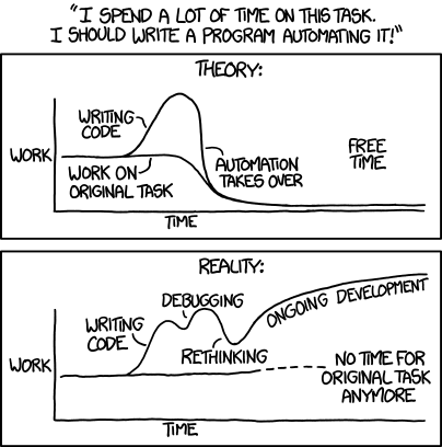
If your query is more complex than this, it might be worthwhile to automate the moving parts. Be sure that any work you do to automate the query can be leveraged if you continue on to building a dashboard. Just don’t forget the long tail of ongoing development!
Ok, now you can build that dashboard
After all this, you should have some pretty pristine data that is very precisely answering a specific question. Which is a perfect place to start when building a dashboard! Data visualization and interactivity is an art, of which I claim very little expertise. If you have some great resources, please drop them in the comments!
